11 Squarespace Tips, Tricks + Hacks (for an epic site)
I’ve been using Squarespace for about 18 months now. And I love it.
In this time, I’ve grown a successful blog, uncovered a ton of advanced capabilities and overcome various technical bottlenecks. So here I am, sharing those insights with you.
These are my top Squarespace tips, tricks and hacks for a successful (and sleek) website.
Let’s get it.
Hey there, just a heads up that some of the links in this post may be affiliate links. That means I earn a small commission. This is at no extra cost to you, but helps me keep the lights on. Thank you for your support!
1. Know Your Brand Keywords
Your website copy should reflect your brand and target audience. This means finding and using the right keywords (in the right places).
So my first tip is to research and know exactly what your target brand keywords are.
Luckily, you can use free tools like ChatGPT, Google and Ahrefs’ Keyword Generator to research phrases and find inspiration.
But a good first step here is to create an audience avatar. Who is your ideal reader and what are their values, pain points and interests?
Dig deep into their demographics and build out a comprehensive profile.
If you’re not sure who your audience is or you have no data, research the competitors in your space.
Explore their website copy and articles and dissect the core keywords they use.
It’s important to remember that this is just for inspiration. You don’t want to copy another’s brand’s keywords verbatim (for obvious reasons).
But it’s a great jumping off point and can spark some ideas.
2. Optimize Your Site
After you know what brand keywords you’ll be targeting and who your audience is, it’s time to optimize your site.
Building out and designing my website is always fun for me – it’s like creative play.
The key is to make sure it’s optimized for the search engines and ranking as well as the user experience (UX).
This topic is pretty big, but if you just get a few core things right, you should be good to go.
Here’s how to optimize your website:
Use your core brand keywords in page title headers, URLs and within the copy
Have clear CTAs that stand out (but don’t add too many – one is enough)
Use blank space to make things scannable
Break up large blocks of text (follow the “less is more” rule here)
Prioritize site speed (for example, compress images to at least 500KBs or less)
Always optimize for the mobile experience (check how things look on mobile)
3. Always Check Mobile
Let’s say you just spent hours finessing your website design.
It looks amazing and you couldn’t be prouder. But – did you check how things look on mobile?
You may be surprised to find that a lot of your design efforts don’t exactly transfer over to a smooth mobile experience.
Whenever you’re in the Squarespace editor making site changes, you’ll see a mobile and a desktop icon towards the upper righthand corner of the screen.
Simply click on the mobile icon to check how things look on mobile.
This is an easy thing to forget to do. But getting into the habit of checking and adjusting regularly will save you hours of work and headaches later on.
Trust me…
4. Add Advanced Customizations + Integrations
Squarespace has most of the essential customization options you’ll need to make a solid site.
But taking things up a notch is always fun.
One of the things I love about Squarespace is the community and amount of resources available online.
Specifically, there are so many amazing, advanced customization options and integrations to play with, buy and add to your site.
For example, I bought this table of contents plugin from Adlytic Marketing and it makes all of my blogs so much more user friendly.
From AI chatbots integrations to custom code plugins, boosting the advanced customization of your Squarespace site is definitely something to play around with (when you’re ready).
Recommended: Squarespace Customization + Site Setup Guide
5. Don’t Forget Your Favicon
Nothing says amateur quite like a missing (or default) favicon.
But what is this thing anyways?
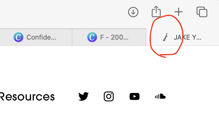
A favicon is that tiny image that shows up on tabs (as you can see in the image above). Usually, websites will make their favicon their logo or something reflective of their brand.
If you don’t choose one however, it’ll often be some default image from your website hosting provider (such as a WordPress image or a square box for Squarespace).
Luckily, it’s super simple to set one up in Squarespace. Here’s how:
From the home menu, click on Settings
Click on Browser Icon
Upload your image
6. Grab A Premium Template
Premium templates are a great way to shortcut your site design and building.
Of course, the free templates from Squarespace are solid starting points.
But if you’re looking for more customization and infrastructure that’s ready to go, premium templates may be your best bet.
The Squarespace community is loaded with a ton of talented designers and experts who create and sell their own custom templates.
For example, you can find lots of awesome templates on platforms like Etsy or directly from websites like The Styled Square.
Alternatively, you can also search for Squarespace designers on Google and work with someone directly to get a more custom job done.
Buying a template can range anywhere from $20 to $300+, and it all depends on the quality you’re paying for, any extra services and what shop you’re buying from.
But on the brightside, many sellers also include things like customer service and exclusive guides or bonus freebies.
So if you’re not into design (and you can swing it), definitely check out premium templates to get a head start on things.
7. Connect to Google Search Console
Connecting your site to Google means you can monitor your traffic, get key analytics and make more data-backed decisions.
You can also request immediate indexing for new posts and pages.
Google Search Console is a web service for tracking, analyzing, indexing and monitoring your website’s performance, traffic and keyword rankings.
Luckily, Squarespace makes setting things up super simple and seamless. Here’s how:
In the home menu, click on Analytics
Click on Search Keywords (on the main screen, while on Traffic)
Select Connect
Sign into your Google account you’d like to connect to and select Allow
Wait 72 hours for things to populate
8. Create A Blog for Traffic
Blogging is the core part of my website’s traffic strategy.
I use keyword research and SEO to write high-quality articles that rank in Google and bring me free organic traffic.
That’s blogging in a nutshell. And I’m a big supporter of it.
Actually, I think everyone should consider starting one. A blog can quickly become a personal asset and brand as much as a rewarding creative project.
So if you’re looking for a way to seriously grow your website, definitely consider starting a blog.
Check out my full review and guide on blogging with Squarespace here!
9. Play Around
The best way to get good at Squarespace (at anything) is to spend time playing around with it.
Test the features, play with buttons and see what happens if you do ____.
The basics of using and customizing Squarespace is fairly straightforward. But you can get pretty advanced and detailed the deeper you dive.
I’d recommend spending time testing the different elements available to you and the different options you can play with in Site Design.
Also, you can check out the myriad of free resources to learn more. A couple places worth mentioning are:
10. Add Your Essential Pages
Most websites will have the staple pages. So it’s important that you also have these essentials.
While every site and brand will require different elements, these are some universal pages everyone should have:
About page
Privacy Policy
Terms & Conditions
Contact page
Homepage
Besides these core pages, some other ones you may need are:
A services or product page
Affiliate Disclosure
Blog
Gallery or portfolio page
Recommended: 16 Characteristics of A Successful Website + Blog
11. Have Consistent Formatting + Branding
Consistency and clear branding is one of the quickest ways to take your website from amateur to pro.
So it’s helpful to get clear on who you are, what your brand is and your style.
Some core branding elements to decide on include:
Font style
Color palette
Tone of voice
Image and video use
Text formatting style
Underlying mission and vision
Logo
Want More? Check Out These Sweet Reads!


